Bing Translator redesign
What is it about?
The project is about visual remake of Bing Translator, along with some additional features.
Is there any business goal?
-
To win in SBS with the competitor.
-
Fix usability issues.
Impact
Designed and implemented. SBS score was +5 with competitor.
Some issues with old experience

-
The editable area is not intuitive.
-
Audio, Swap and copy button are too small
-
Fonts scaling.
-
Mobile version was not usable when the keyboard is up.
Full design with interaction


Translated state - collapsed
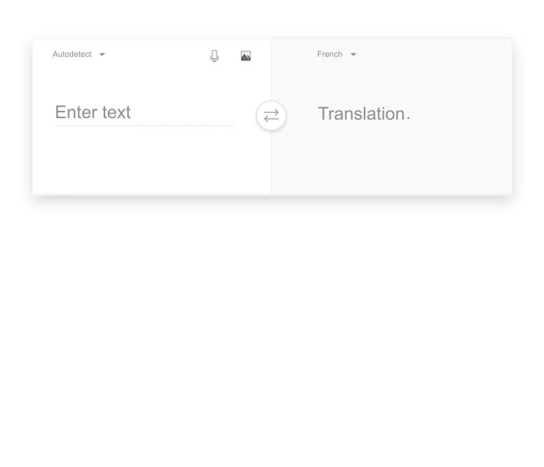
Default states
Edit state
Suggestive word
Translated state - expanded
Desktop answer
Mobile answer
Default states


Font scaling
40px, lh- 48
32px, lh-36
24px, lh- 28
Hello
Font scaling
Translated state ( expanded)
Translated state ( collapsed)
Hello
Hello
Hello
18px , lh- 24
Hello
32px, lh-36
Hello
24px, lh- 28
Hello
18px , lh- 24
Bing Translator
Before
After

